
How to Make Your Website Accessible for Color-Blind People
Marketers, website content creators, designers, and developers need to consider how their color choices can impact people both on the web and in print marketing materials. Colorblindness is, unfortunately, an often forgotten disability that can make websites challenging to navigate, use, and read.
This article provides an overview of how to create websites that are easily perceived by people who are color-blind.
What is Colorblindness?
About 300 million people around the world are color blind. Typically, someone who is color blind has problems discerning between two colors. However, color blindness comes in many different forms, degrees, and combinations of color blindness. Because of the many variations in color blindness, it can be challenging to determine which combinations will be worst for all color-blind people.
Forms of Color Blindness
Some of the most common forms of color blindness include:
Red-Green Color Blindness
Red-green color blindness is the most common form of the condition. There are two subtypes of red-green color blindness: Deuteranopia and Protanopia. People with Protanopia cannot perceive red light, while people with Deuteranopia are unable to perceive green light. Both make it hard (or sometimes impossible) for people to see and distinguish between reds and greens.
Blue-Yellow Color Blindness
Blue-yellow color blindness is also known as Tritanopia. People with Tritanopia cannot perceive blue light. This makes it difficult or, in some cases, impossible to see and distinguish the difference between yellow and blue.
Red-Black Color Blindness
Red-black color blindness is less common than red-green or blue-yellow color blindness. Typically, someone with red-black color blindness has problems distinguishing between the two colors when placed on each other. For example, if a web page has a black background with red text, someone with red-black color blindness will not be able to read it.
Total Color Blindness
Total color blindness, or Achromatopsia, is very rare. Someone with Achromatopsia cannot see any color. Instead, they see things in grayscale.
Design Considerations for People Who Are Color Blind
Unfortunately, there are not many forms of assistive technology for color-blind people like there are for people who are blind or have low vision. Content creators and designers need to be mindful of color combinations from the beginning of the design process.
There are two primary design considerations for making your website work for people who have color blindness: color contrast and not using color alone to convey meaning.
Pay Careful Attention to Color Contrast
For people who are color blind, proper color contrast is essential. This is especially true for color combinations like red/green, red/black, or blue/yellow. Without enough color contrast between two different elements, people who are color blind may not be able to distinguish between them.
To verify that you have met the necessary color contrast, try entering your color codes into WebAIM’s color contrast verifier opens a new window. You also want to check to make sure your color palette works for people with various types of color blindness. Here are a few tools we recommend for checking if your website and designs are color-blind safe.
Adobe’s Accessible Color Palette Generator
We recommend using Adobe’s free accessible color palette tool opens a new window to simulate how a color palette will look to people with various forms of color blindness.
Enter your color palette into Adobe’s accessible color palette generator. This can help you identify if there are colors in your palette that conflict with one another for people with different forms of color blindness. For example, in this color palette, the two colors in columns D and E have been flagged as not being significantly different for people who have Deuteranopia and cannot perceive green light.
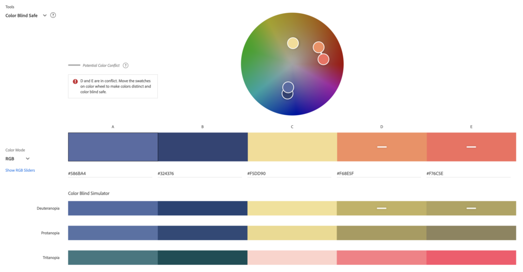
Adobe’s accessible color palette generator denotes colors that conflict with one another by adding a bar to the colors in your palette and adding a message to the left of the color selector above your palette.
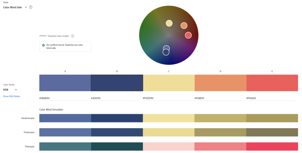
If this were your color palette, you would want to change one or both of the colors in columns D and E to ensure that people with Deuteranopia color blindness can adequately distinguish them. By slightly darkening the color in column E, for example, we can make this color palette work for everyone.
Stark
Stark opens a new window is a plugin for Sketch, Figma, and Adobe XD that allows you to test for color contrast and simulate color blindness as you design. It has a free tier that is great for getting started and affordable annual pricing well worth the $60/year fee.
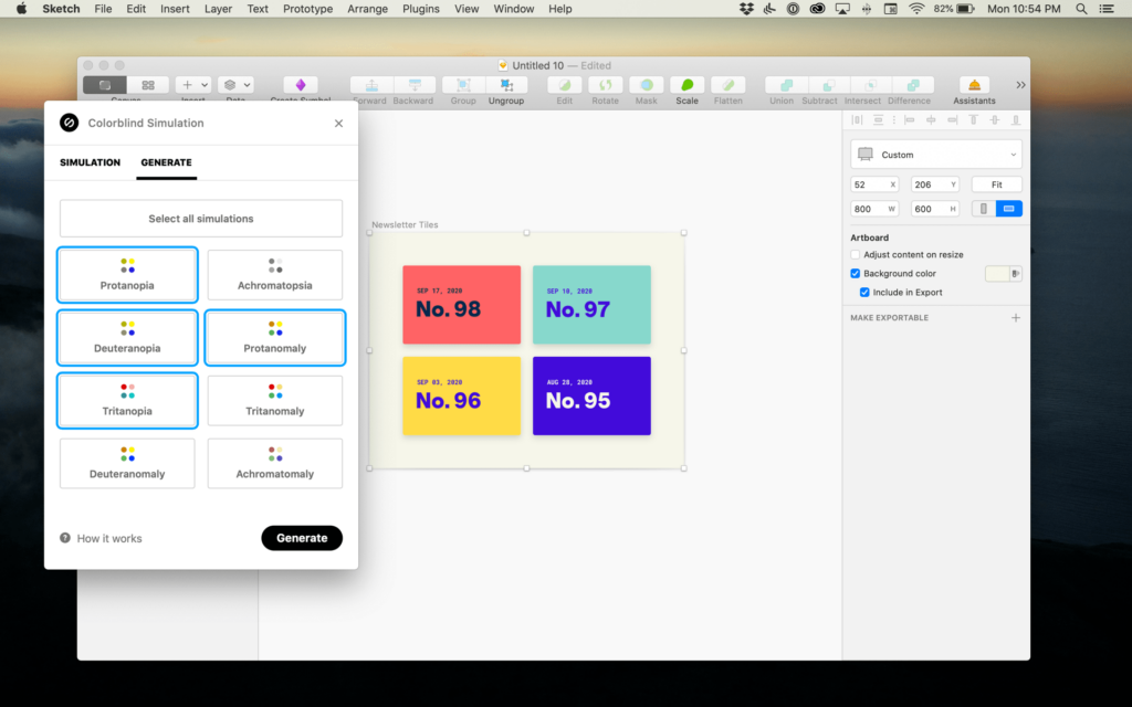
Organizations that “shift left” with accessibility and address potential accessibility problems before coding save a lot of time and money, as there are fewer items that need to be remediated or reworked later. Adding a tool like Stark to your design process and checking to see how your designs appear to people who are color blind will reduce dev work later on.
Colorblindly
What if your website is already launched, and you want to test it for color-blind accessibility? Colorblindly is a free Chrome extension that we frequently use when auditing websites. If you install it in Chrome, you can turn it on any website and simulate different types of color blindness. This will show you what the website would look like for those people. Here’s an example of the Colorblindly simulation of how our home page looks to people with Tritanopia or blue blindness:
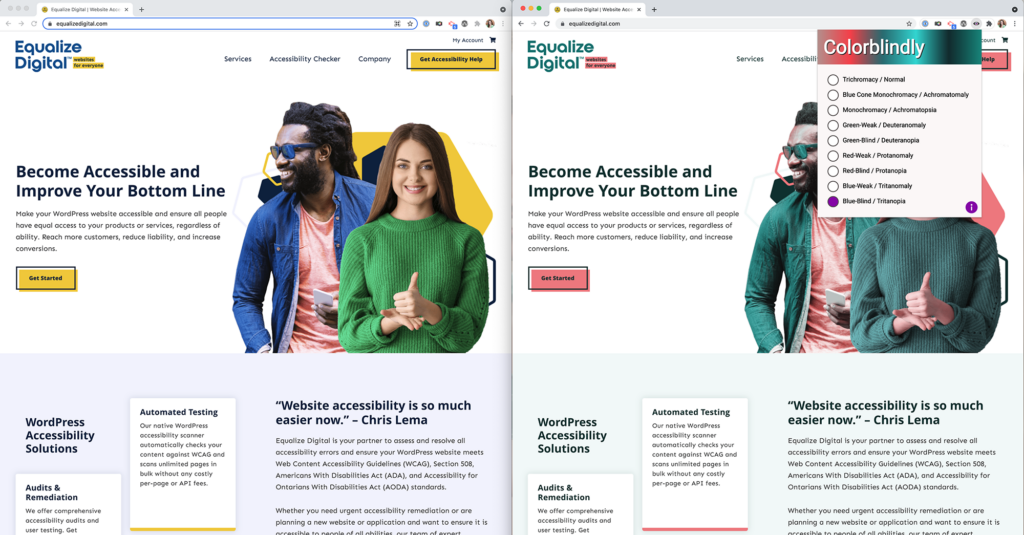
When doing color-blind simulations on your website, check that everything is legible and understandable, even if website visitors can only see some or none of the colors. Regardless of the form of color blindness, they still need to be able to engage with the website fully.
Don’t Use Color Alone to Convey Meaning
Another critical aspect of color-blind accessibility is ensuring that crucial information on a web page is represented by something other than color. This applies to various elements on websites, including graphs and charts, icons, and buttons.
Colorblind-Friendly Data Visualizations
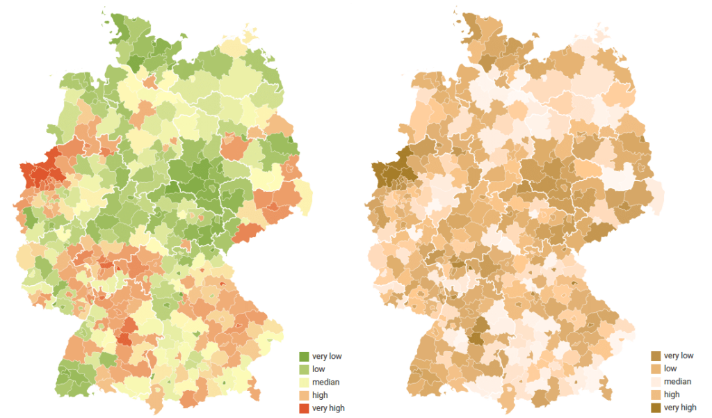
In their post announcing the addition of color-blind checks to their software, Datawrapper, a SaaS for creating charts, maps, and tables, provides this example of how a density map may look to people with red-green color blindness opens a new window:
Bar charts and other graphs can also be difficult for people who are color blind. If your website includes complex data visualizations, you’ll want to think about ways to convey the information in the graphs without relying on color alone. This chart, for example, makes use of both color and patterns on the bars so that it’s easier to match them to the key:
Towards Data Science has a great article on making data visualizations colorblind-friendly opens a new window. We highly recommend it if you include graphs and charts on your website.
Colorblind-Friendly Buttons and User Interface Components
Beyond maps, charts, and graphs, when designing the user interface components for websites and web applications, it’s also important to not rely on color alone to convey meaning.
For example, suppose you are creating a scale where green, yellow, and red indicate the difficulty level for games. In that case, you shouldn’t communicate that just with colored circles, especially if you don’t have a key or are describing the difficulty with written text that relies on the color alone (such as “all the games marked with green are easy to play”). As you can imagine, this sort of key could be challenging for some people to understand.
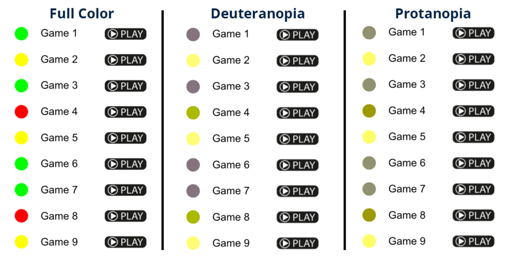
A better example of how to convey meaning in this example would be to use a color and shape combination, such as is used to represent the difficulty of ski slopes.

There are three different ski slopes in the image above, and each one has a difficulty level that utilizes more than just color to label the difficulty. Here, the easiest trail is a green circle, the more difficult trail is a blue square, and the most difficult is a black diamond. The inclusion of shapes and words describing the difficulty level ensures that everyone can choose the slope that matches their skiing abilities, even if they cannot see every color.
When designing user interface components for websites, it is equally important to make sure that color alone is not used to denote important information and to, similarly, include shapes, icons, and words in your designs.
Example Scenario: How Accessibility Helps Color-Blind Web Users
This is Sean. He is red-green color blind. Sean works at an architecture firm with several other designers, who meet regularly to discuss their projects and plans for new developments.

Now that Sean is working from home, he has to make many video calls to talk to the other designers on his team. The video conference software uses text to tell Sean when his team members are online and ready to chat. The video conference software also has a feature that allows Sean to view only the person who is speaking, switching video each time someone new speaks.
So what if Sean’s video conference software didn’t have these features? What if there was simply a red or green dot instead of text denoting whether someone is available? Since Sean is color blind, he would not be able to tell if his team members were online just by looking at the dot. Instead, Sean would have to send individual messages to his team members to see if they were online and ready to join the video call.
Additionally, if Sean’s video conferencing software simply highlighted the speaker in green, rather than switching to the video of whoever is talking, Sean might not be able to figure out who was speaking as quickly. This could cause Sean a lot of frustration and even cost him valuable time that he could be using for other work.
Wrapping It All Up
In our scenario with Sean, we described how accessible design made his team meetings efficient and straightforward. Additionally, if colorblindness were not considered in his video conferencing software, it could cause frustration for him at work or lead to a loss of valuable time.
When website owners and developers think about accessibility, they don’t always consider the needs of people who are color-blind. Accessibility features on websites benefit a broad audience – many of whom are people you may not frequently think of as “disabled” – and it is essential to consider how to make your website usable for everyone.
Don’t forget other Web Content Accessibility Guidelines
In addition to these color blind-specific considerations, it’s also important to remember other guidelines and standards for general accessible design, such as those laid out in the Web Content Accessibility Guidelines (WCAG) opens a new window.
WCAG helps content authors, designers, and developers create accessible websites by laying out a framework for success. For your website and its content to be considered accessible under WCAG, it should be perceivable, operable, understandable, and robust enough for users with all types and abilities to access it.
WCAG success criteria and levels of conformance help content creators, web designers, and developers ensure they are meeting the necessary requirements. As you’re working to make your website accessible, we recommend reviewing these guidelines and becoming familiar with them. What we have listed here are just a small part of building accessible websites.
Get Help Making Your Website Accessible
If you have questions about making your website accessible for color-blind people or other user types, please don’t hesitate to contact us. Our team of WordPress accessibility specialists are here to help you.
If you have a WordPress website and would like to scan it for accessibility problems, check out our free WordPress Accessibility Checker plugin opens a new window. Accessibility Checker can identify color contrast and other accessibility problems you should fix to make your website more accessible to everyone.